
Humankind Swim is a brand rooted in the desire to be the kindest possible humans, with a focus on inclusivity and community. Its mission is to provide swim and loungewear options to its customers that haven’t previously had options they were excited about without compromising their personal style. Humankind’s clean and bold brand identity evokes feelings of solidarity and strength.
In partnership with Tributary Design Studio


Gender-inclusive swimwear and apparel
BRANDING
Humankind’s clean and bold brand identity evokes feelings of solidarity and strength.
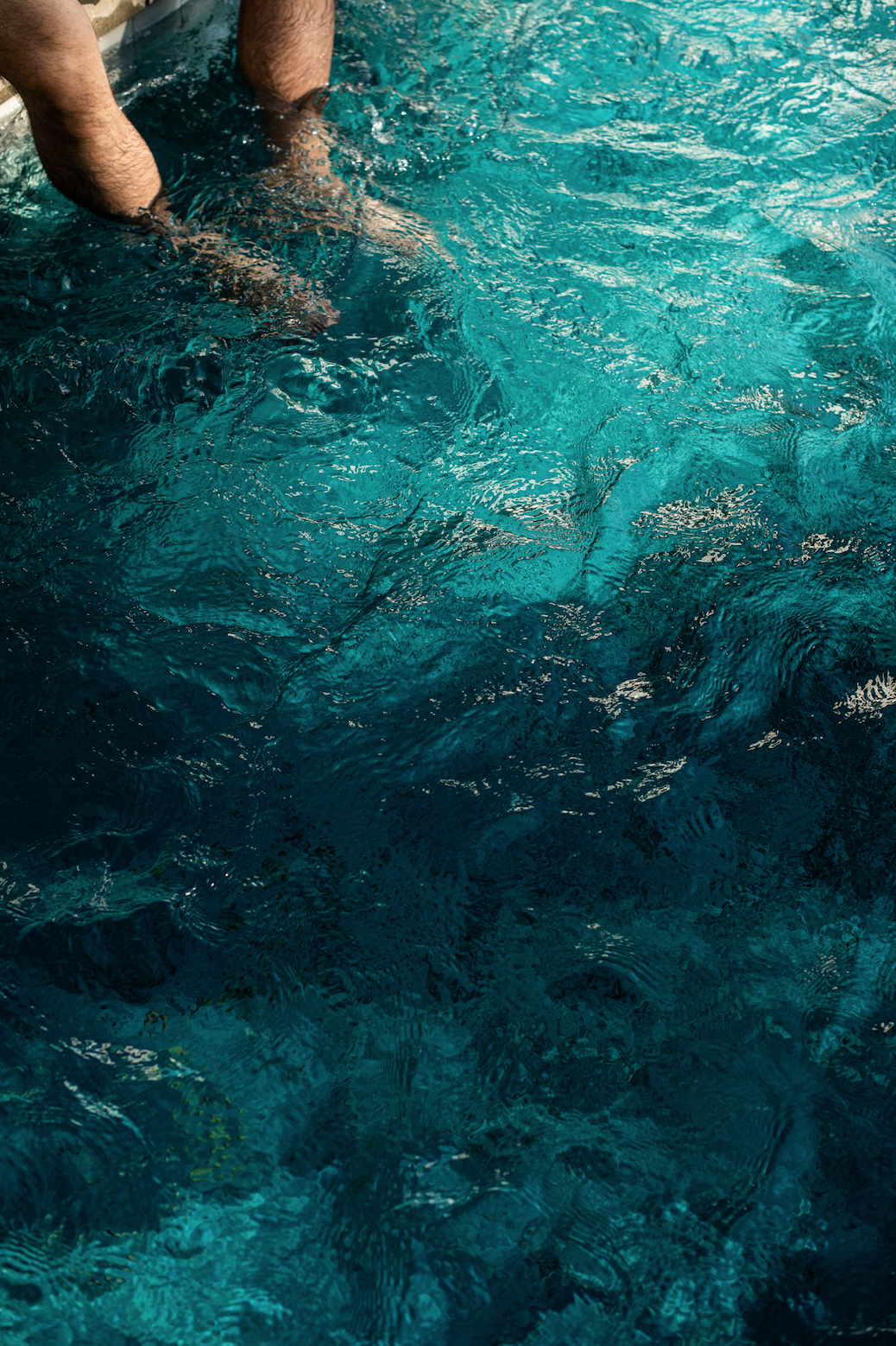
The water-like movement of the logos and patterns, communicate Humankind’s roots in Swimwear while also representing movement in humanity. Together, the logo, colors, typeface and patterns feel approachable yet sophisticated and unique shapes help differentiate the brand from its competitors.
Brand Strategy | Logo, Color Palette & Typography | Pattern Design | Icon Design


PATTERN DESIGN
With all new branding, Humankind needed some new patterns to match. Soft gradients in mimicked the fluidity of their logo and fingerprint designs pulled through the human connection element.
