

High impact branding for highly impactful malt.
As part of a global family of brands, Canada Malting Co., Great Western Malting, and Country Malt Group all share the same values of diversity, equity and inclusion. The Pink Boots Malt was born from the idea to involve more members of the industry in our efforts to uplift women and non-binary colleagues, as malt is a core ingredient for both brewers and distillers. With each bag purchased, a donation is made to the Pink Boots Society scholarship fund to support their mission: to assist, inspire and encourage women and non-binary individuals in the fermented/alcoholic beverage industry.
I worked with the United Malt team to design branding, packaging, merchandise, and other print and digital collateral for their limited edition release. Their team wanted the brand to be retro and slightly feminine.
Branding | Packaging | Merchandise | Social Media

PACKAGING & MERCHANDISE
After developing the brand, we got right to work designing the malt bag packaging. We highlighted the pink boot with fluffy clouds and bright retro sun rays.
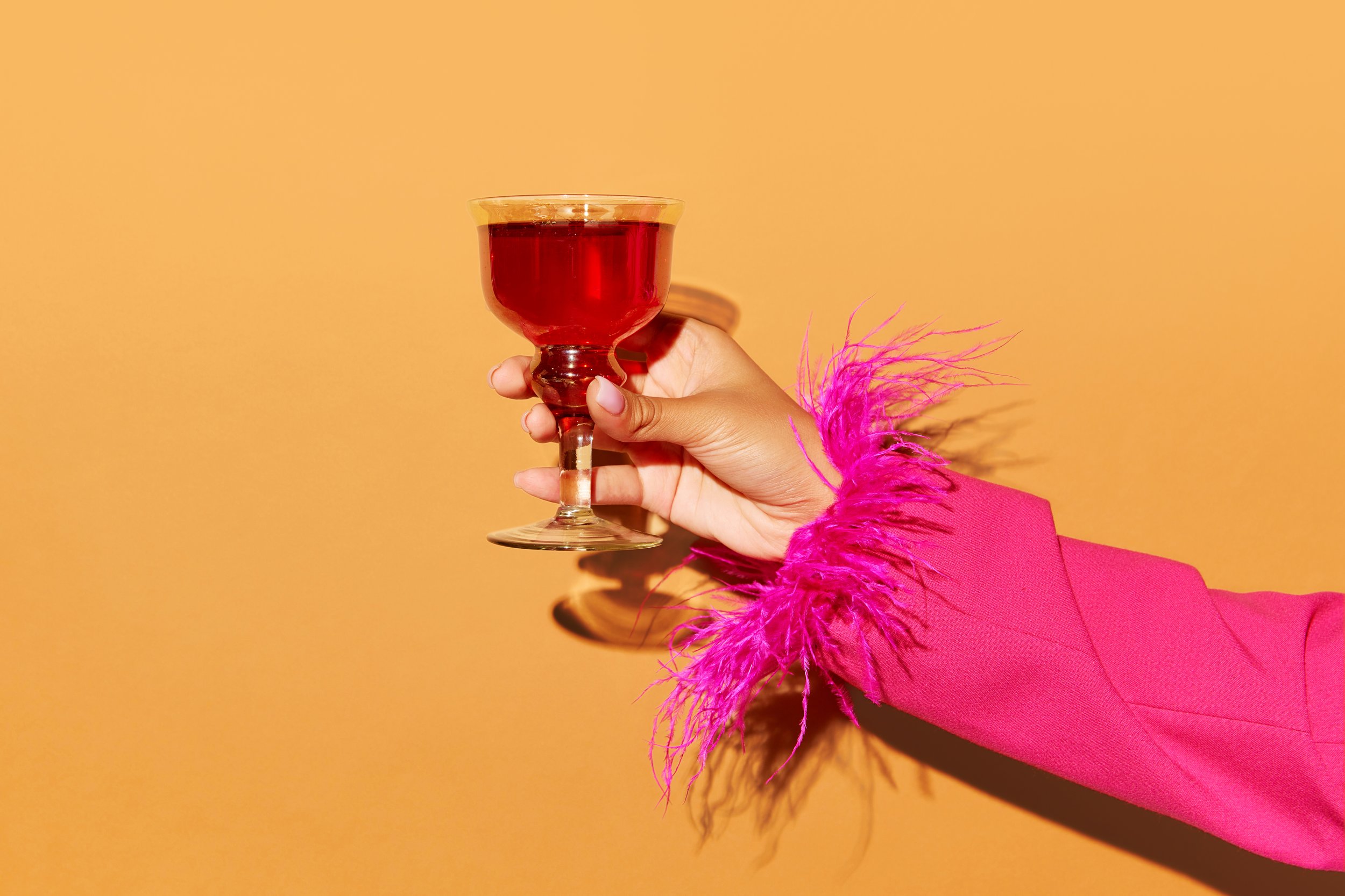
We worked on a number of pieces of merchandise to launch this limited edition malt. Tshirts, stickers, and glassware were part of the first items designed to be given out to staff and launch party attendees.


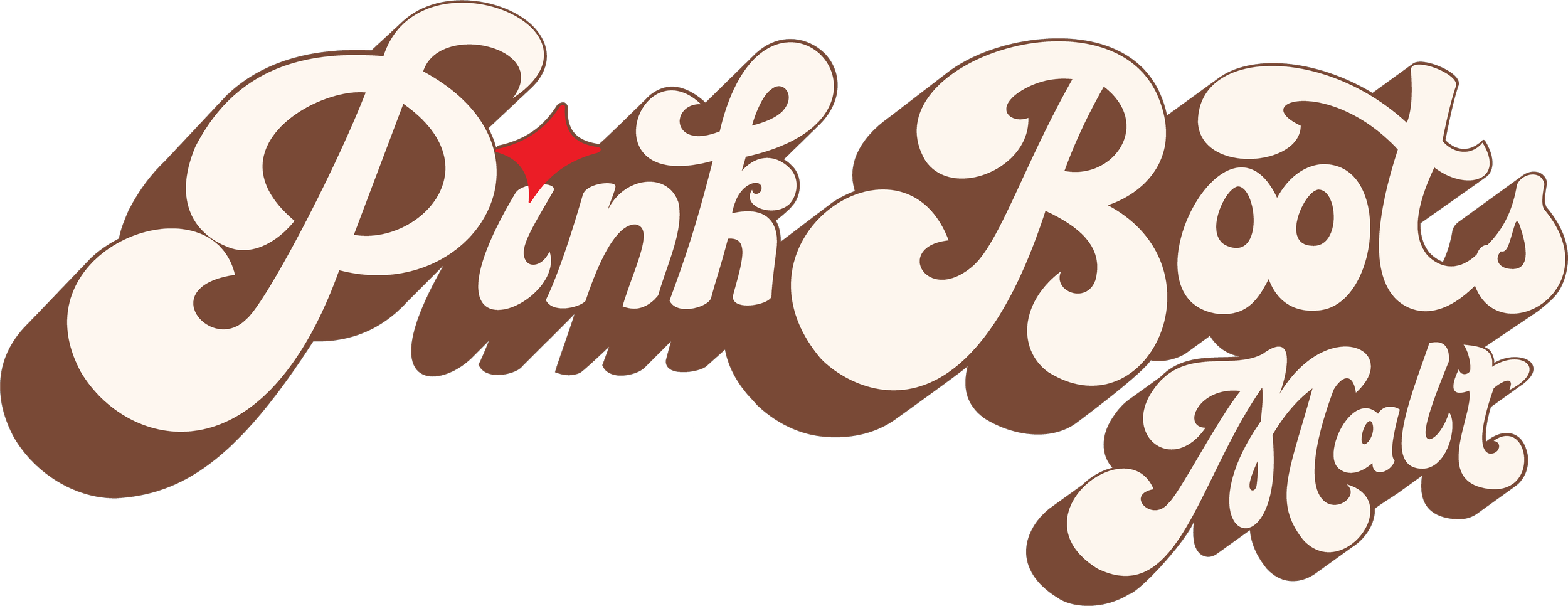
BRANDING
The Pink Boots Malt color palette is a celebration of boldness and vibrancy. Pinks, yellow, and red play together to form a palette that mirrors the vibrant flavors this malt adds to brews and spirits. Round, funky fonts bring in a 70’s feel. A suite of icons lend versatility to the brand, but the iconic pink cowboy boot — symbol of individuality and flair — is featured prominently.
